Logo Design Projects
I create distinctive logos for a variety of companies and industries, tailoring each design to capture the unique essence, values, and goals of every client. My work balances creativity and strategy, resulting in memorable, versatile marks that help brands stand out in their markets. From bold contemporary icons to timeless wordmarks, my logo designs deliver lasting visual impact and support strong brand identities across a broad spectrum of businesses.
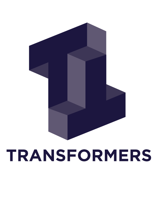
I created a distinctive logo for an internal ticketing tracking system I led from conception through optimization. The logo aligns with the company’s branding standards by employing different shades of blue, presenting a cohesive and professional appearance. The core visual element is a block-style letter "T" cleverly designed to play a mind trick—at first glance, viewers see multiple "T"s interwoven, adding depth and intrigue to the mark.
This design balances simplicity with a subtle optical illusion, capturing attention while communicating the system’s role in tracking and managing tickets efficiently. The use of varied blue tones reinforces trust and reliability, key attributes for an internal business tool, while maintaining strong brand consistency.
Transformers Logo
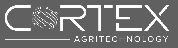
I created the logo for Cortex Agritechnology, a farmer-founded agriculture technology company dedicated to providing data-driven solutions for poultry and livestock management. The logo reflects the company’s innovative, science-based approach and their commitment to empowering farmers with actionable insights.
The design incorporates a modern, clean aesthetic that aligns with Cortex’s brand identity, emphasizing reliability, technology, and agricultural roots. The color palette and typography follow the company’s visual standards to ensure coherence across all marketing and digital platforms. The logo symbolizes Cortex’s goal to transform farm management through flexible, scalable technology solutions, combining agricultural elements with a tech-forward look to resonate with their target audience in the AgTech industry.
Cortex Agri Logo
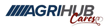
AgriHub Cares Logo Adaptation
I created an adaptation of the AgriHub logo to launch "AgriHub Cares," an employee-driven community initiative in Manitoba dedicated to supporting local causes and families in need. To visually communicate the program’s focus on compassion and community, I incorporated a heart symbol into the existing AgriHub logo. This subtle yet impactful addition reinforces the values of care and support at the core of AgriHub Cares.
The adapted logo maintains the brand’s recognizable integrity, using consistent colors and typography, while the heart element instantly conveys empathy and connection. This new visual identity not only unifies the charitable activities under one banner, but also strengthens AgriHub’s presence as a company deeply invested in the wellbeing of its employees and communities.
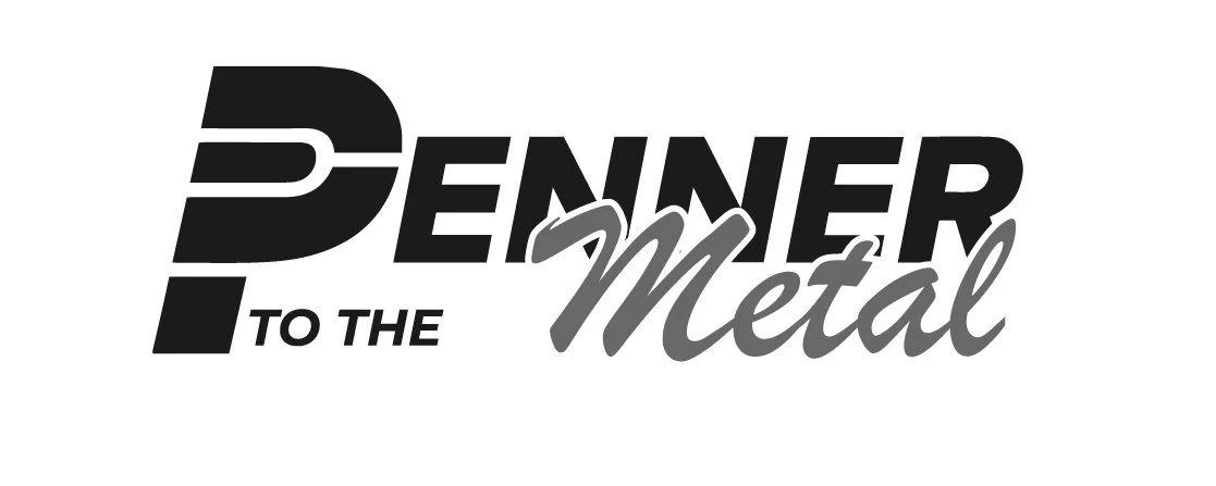
Penner to the Metal Logo Adaptation
I created a dynamic adaptation of the "Penner to the Metal" logo to represent their go-kart racing activities. The design reflects the fast-paced, competitive spirit of go-kart racing with bold typography and graphic elements that convey speed and momentum. The logo adapts the original branding to emphasize motion and energy, making it instantly recognizable and fitting for racing events or team merchandise.
The visual style incorporates elements that suggest both power and precision, aligning with the adrenaline-driven nature of go-kart competitions. This logo adaptation supports Penner to the Metal’s brand identity by connecting their name with the thrilling experience of go-kart racing, appealing to both participants and fans.
Cushman & Wakefield | Stevenson – 20 Years Logo Adaptation
I designed a special adaptation of the Cushman & Wakefield | Stevenson logo to commemorate the company’s 20th anniversary. This version integrates a prominent “20 Years” element into the existing logo, maintaining full alignment with the brand’s established visual standards, including the use of its signature red, grey, and white palette and modern, clean typography.
The “20 Years” addition is seamlessly incorporated, striking a balance between celebration and professionalism—it calls attention to the milestone without overwhelming the core brand identity. This adaptation is ideal for use across anniversary-related marketing materials, signage, social media, and internal communications, reinforcing the firm’s legacy of trusted service and leadership in the real estate industry.
By highlighting two decades of excellence, this logo variation not only honors the company’s history but also underscores its ongoing commitment to quality, reliability, and client partnership.

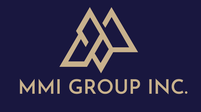
I designed the logo for MMI GROUP INC, a new company specializing in property investments, with a modern and meaningful visual identity. The core of the logo is an intertwined "M" that creatively represents the different departments within the group—brokerage, property management, and investments—symbolizing their interconnectedness and collaborative strength.
This design choice visually reinforces the unity and integration of varied services under one corporate umbrella, emphasizing synergy and comprehensive expertise. The use of clean, professional lines and a balanced typographic treatment conveys stability, trust, and forward thinking—qualities essential for the property investment industry.
The color palette and overall style maintain a sleek, contemporary look that aligns with industry expectations while giving MMI GROUP INC a distinctive and memorable brand mark. This logo effectively communicates both cohesion within the group and the individual strengths of its core divisions.
MMI Group Inc Logo