Print Design Projects
Showcased here is a selection of print design projects I’ve created for a range of clients and industries. Each piece was custom-designed to capture the unique goals, brand personality, and messaging of each client—whether for promotional posters, brochures, packaging, or marketing collateral. These projects highlight my versatility and dedication to delivering high-impact, visually engaging print solutions tailored to every client’s needs.
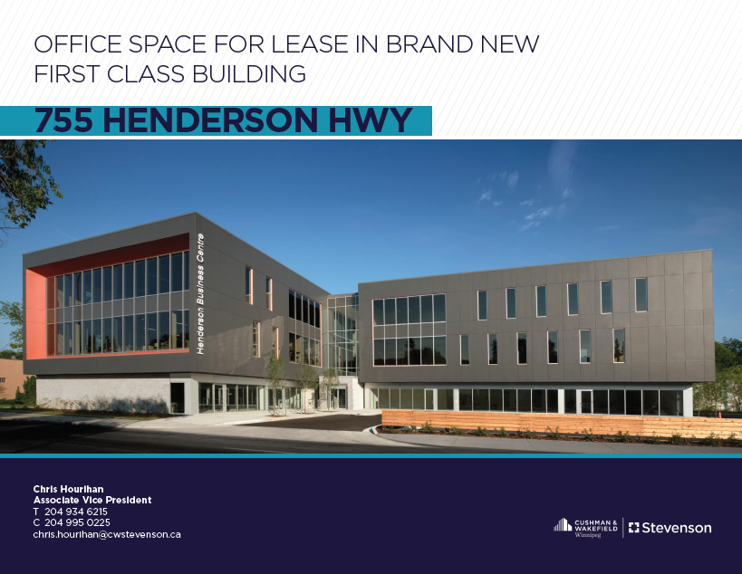
I designed a polished and on-brand property brochure for Cushman & Wakefield | Stevenson, tailored to showcase a Winnipeg property on behalf of an agent. The brochure integrates high-quality imagery that captures the essence and appeal of the property, supported by clear and compelling descriptions that highlight its features and unique selling points. Essential details such as the property price and a detailed overview provide prospective buyers or investors with critical information upfront.
The brochure also includes a custom map location, helping viewers easily situate the property within Winnipeg, alongside a curated list of nearby amenities that emphasize the convenience and lifestyle benefits of the area. Throughout, the design maintains consistent branding with Cushman & Wakefield | Stevenson's sophisticated and professional visual identity, combining clean layouts, elegant typography, and a restrained color palette to ensure clarity and a premium feel.
This brochure effectively supports the agent’s marketing efforts by presenting the property in a compelling, visually engaging format that resonates with target clients in commercial real estate.
Property Brochure
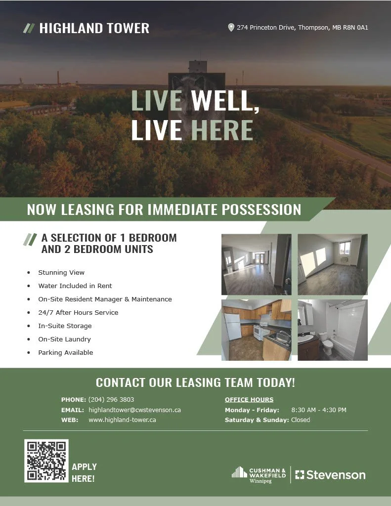
I designed a vibrant and attention-grabbing sellsheet to promote the residential units available for lease at Highland Tower. This piece features a carefully curated color palette that I developed specifically to embody the building’s contemporary identity and inviting atmosphere. The layout strikes a balance between bold visual appeal and clear, concise communication, showcasing high-quality imagery of the suites alongside key details such as floor plans, amenities, and contact information.
To ensure cohesive branding across platforms, I extended the custom visual identity from the sellsheet to Highland Tower’s new website, collaborating on its creation to deliver a seamless experience for prospective tenants. This holistic approach to print and digital design reinforces Highland Tower’s position as a desirable residential choice and maximizes marketing impact.
Highland Tower Sellsheet
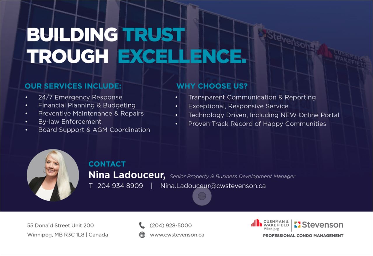
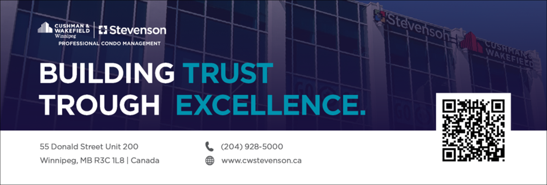
I created a pair of print ads for Cushman & Wakefield | Stevenson that highlight their property management expertise while staying true to the company’s established brand identity. Both ads use the firm’s signature color palette, clean typography, and balanced layouts to ensure brand consistency and instant recognition.
The first ad focuses on “What We Do”, outlining the full scope of Cushman & Wakefield | Stevenson’s property management services — from maximizing asset value and maintaining properties to fostering strong tenant relationships. The design pairs confident, concise messaging with professional imagery to communicate credibility and experience.
The second ad serves as a direct “Contact Us” invitation, encouraging property owners and decision-makers to connect with the team. A clear call to action, prominent contact details, and an open, approachable design make it easy for readers to take the next step.
Together, these ads work as a cohesive series — the first building awareness of services, the second driving engagement — all while reinforcing Cushman & Wakefield | Stevenson’s reputation as a trusted leader in property management.
Print Ad Series
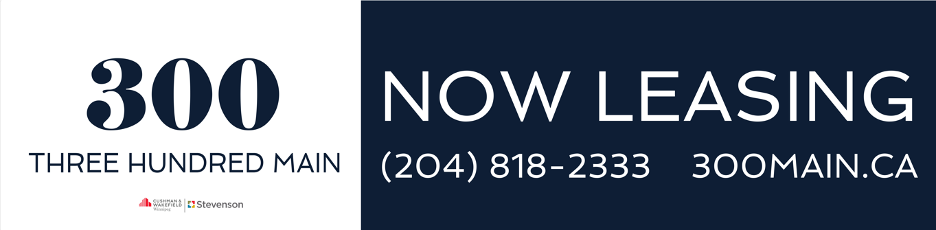
I designed a bold and visually compelling banner to promote the leasing of residential units at 300 Main. The banner effectively communicates availability and leasing opportunities, using clear, concise messaging that invites prospective tenants to inquire or apply. The design incorporates a clean layout with strong typography and a balanced color palette that aligns with the building's branding or marketing goals.
High-impact visuals and prominent calls to action ensure the banner draws attention and conveys key leasing information quickly—making it an effective marketing tool to attract interest and drive occupancy.
Leasing Banner

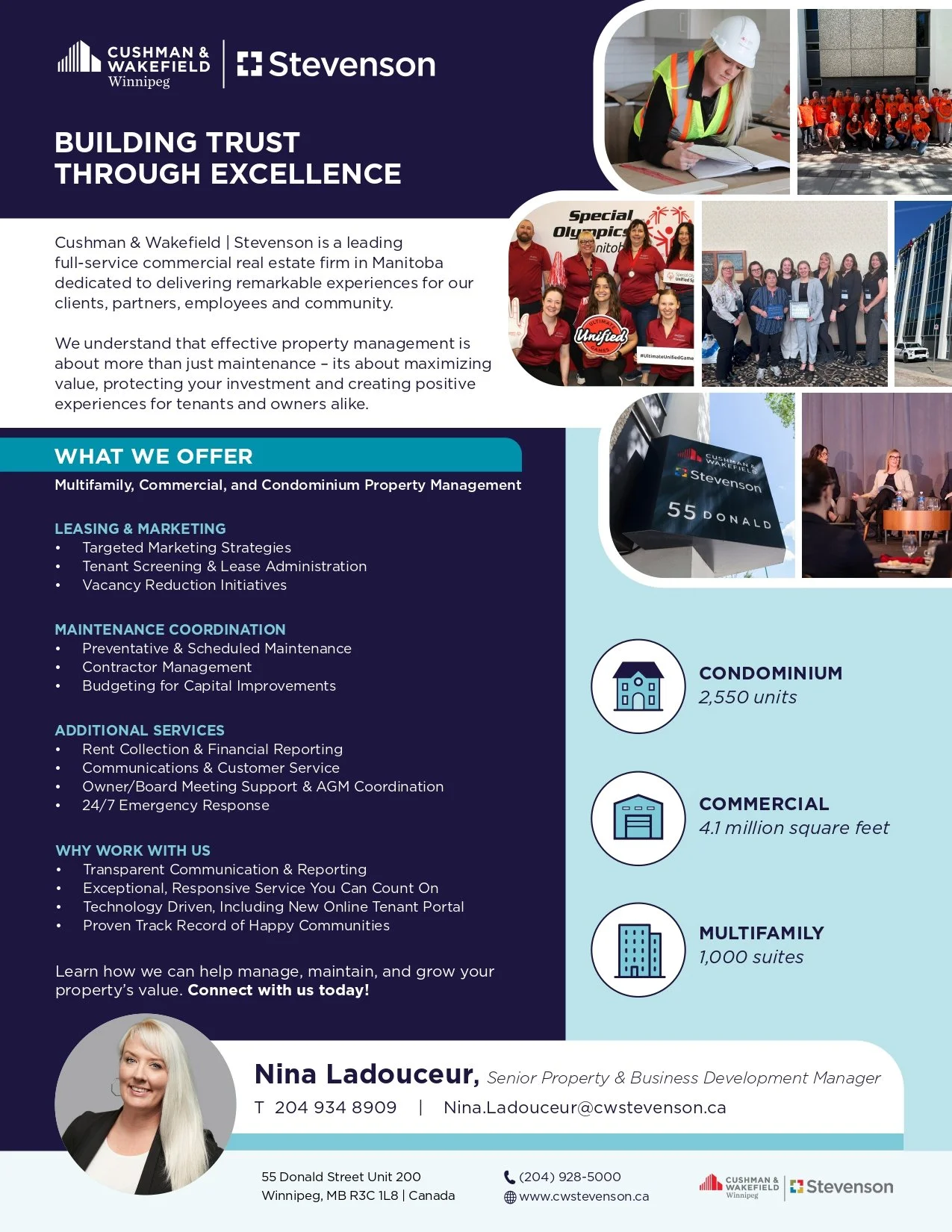
I designed an impactful “About Us” one-pager for Cushman & Wakefield | Stevenson’s property management division. The layout balances professionalism with approachability, using their signature red, grey, and white brand colors and modern typography for a cohesive, polished look. Key sections highlight the firm’s experience, breadth of service, and commitment to client satisfaction, all supported by clean, easy-to-read formatting.
High-quality imagery and subtle graphic accents reinforce CWS’s reputation and industry leadership, while icons and callout boxes make their core services and values stand out at a glance. The result is a concise, on-brand piece that communicates CWS’s property management expertise and sets the right tone for both new and existing clients.
About Us
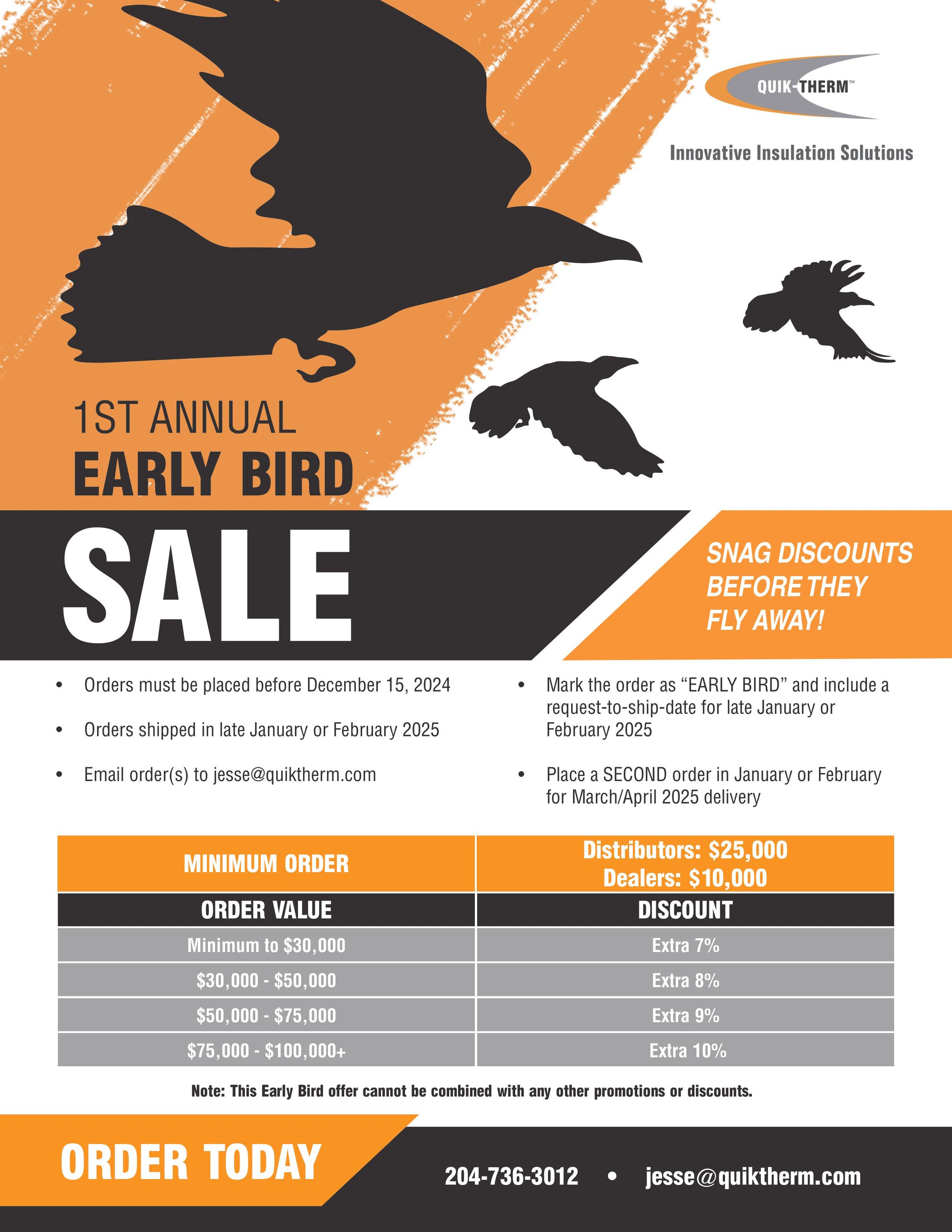
I designed a vibrant promotional flyer for Quik-Therm’s early bird sale, incorporating brand-aligned orange and grey colors and their signature typography to ensure consistency with their visual identity. The flyer creatively uses bird imagery to symbolize the early bird theme, making the promotion visually engaging and memorable. The layout balances bold graphics and clear sale information to capture attention quickly and communicate the special offer effectively. This flyer supports Quik-Therm’s branding while driving early customer interest in their products.
Early Bird Sale Flyer
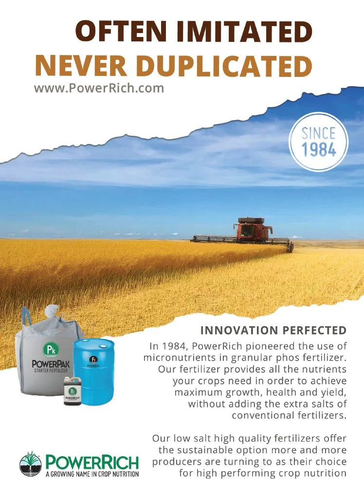
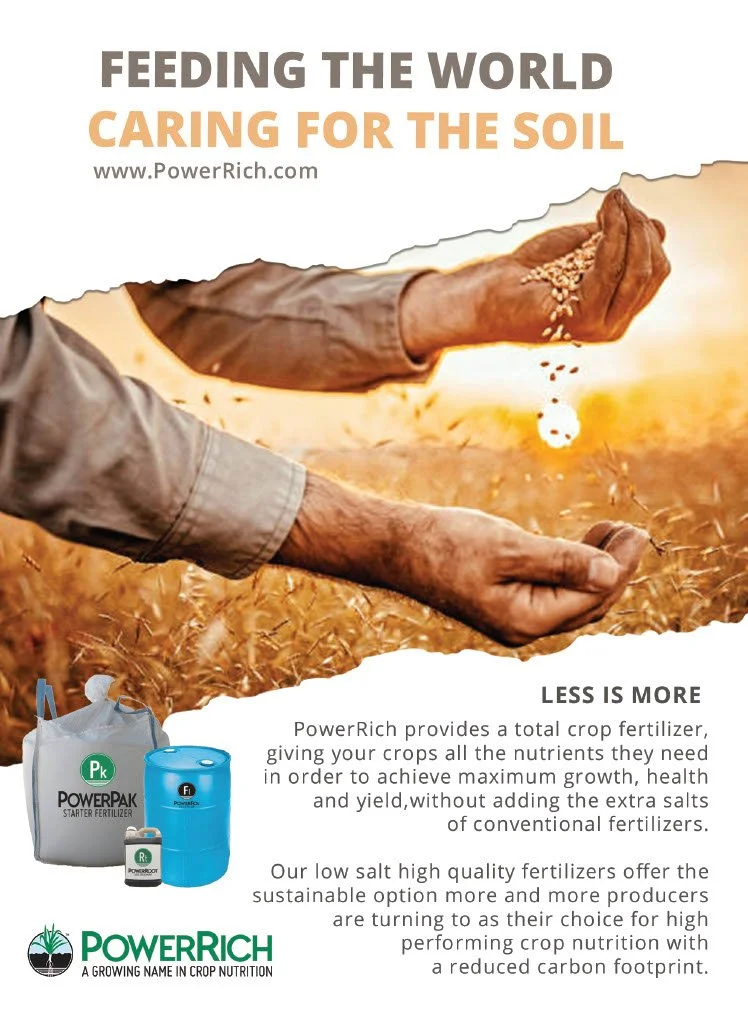
For PowerRich Corp., I designed two striking print ads that showcase the company’s values and industry leadership through compelling visuals and targeted messaging.
The “Feeding The World” ad centers on PowerRich’s commitment to global agriculture and sustainable growth. Powerful imagery and bold headlines highlight how their innovative crop nutrition solutions support farmers in nourishing communities worldwide. The clean layout and vibrant colors evoke vitality and optimism, reinforcing the brand’s dedication to making a positive impact on food production.
The “Often Imitated, Never Duplicated” ad positions PowerRich as a pioneer and industry original. Dynamic design elements and confident typography underline the company’s reputation for quality and innovation. The messaging makes it clear that while others may try to emulate PowerRich’s success, their superior products and expertise remain unmatched in the market.
Together, these ads effectively communicate PowerRich Corp.’s mission and distinctiveness, combining consistent branding with focused campaigns to engage and inspire their target audience.
Print Ad Series
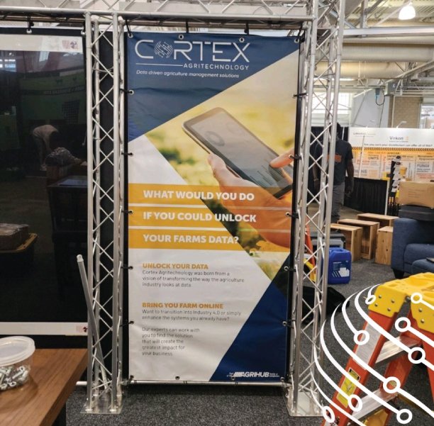
I designed a visually engaging rollout banner for Cortex Agritechnology, reflecting their innovative and farmer-focused brand identity. The banner incorporates bold, clean graphics inspired by agricultural themes and data-driven technology, aligning with Cortex’s mission to empower farmers with real-time insights for livestock and poultry management. Using a balanced color palette consistent with Cortex’s brand (commonly including natural, earthy tones and modern accents), the layout ensures strong readability and immediate brand recognition from a distance.
Key elements include clear messaging that highlights Cortex’s commitment to improving farm efficiency and animal welfare through advanced monitoring solutions. The design also features modern typography and subtle iconography representing data and technology to visually communicate Cortex’s position at the forefront of AgTech innovation.
This banner was crafted to maximize visual impact at tradeshows, providing an inviting, professional presence that captures the essence of Cortex’s mission and values.
Rollup Banner